I Turned My Portfolio Into a Fake Operating System.
Arun Sajeev
8 min read · Apr 7, 2026
What happens when a designer partners with AI and loses all sense of scope?
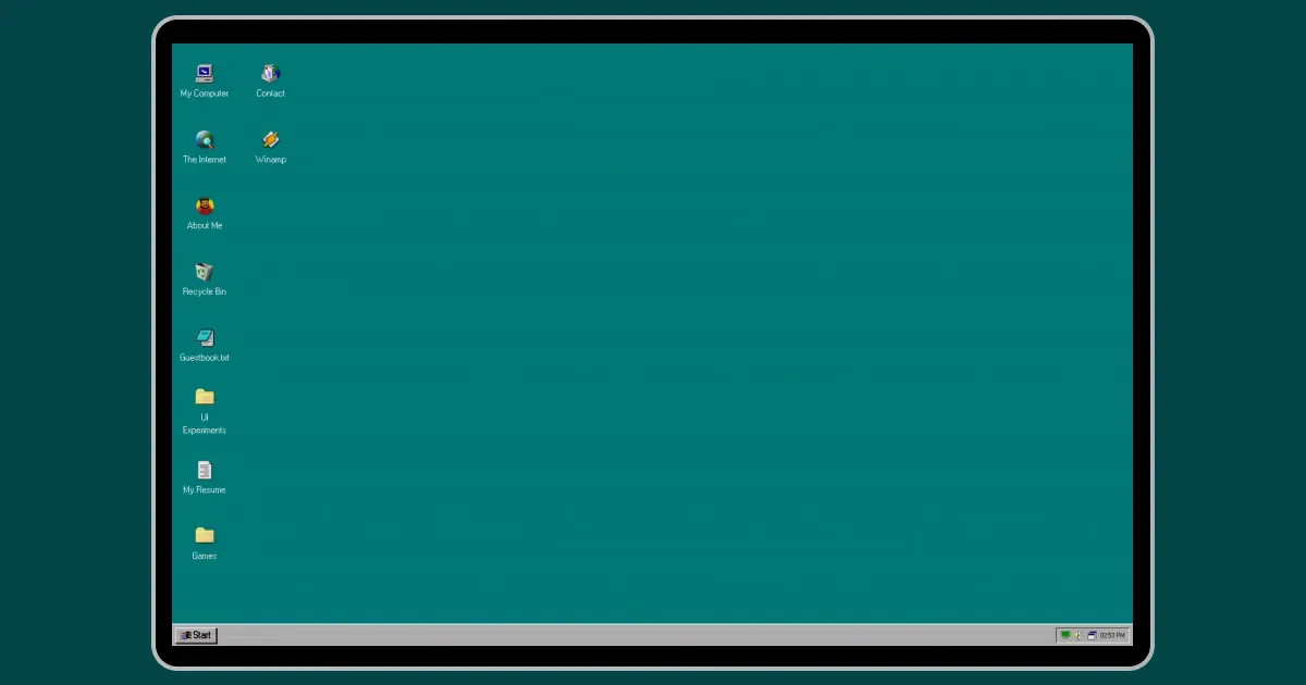
I've had portfolio website for a while, but it was bare bones. The kind of site where I'd message my developer friends every few months, asking if they could "just tweak this one thing." They were patient about it, but deep down I knew the real problem wasn't a CSS fix. The whole thing needed a rethink.
Every time I thought about redoing it, I'd end up with the same thing in my head. A grid of thumbnails. A sans-serif headline. A "Let's work together" button at the bottom. It always felt like filling out a form. Not like showing who I actually am.
Then one evening, I was browsing GitHub and stumbled upon an open-source Windows 95 desktop recreation. Someone had built a basic shell with draggable windows, a taskbar, and a Start menu. And something about it just clicked. That nostalgic feeling of booting up your school lab's computer, hearing the startup sound, and double-clicking on icons. I sat there for like 20 minutes just opening and closing windows.
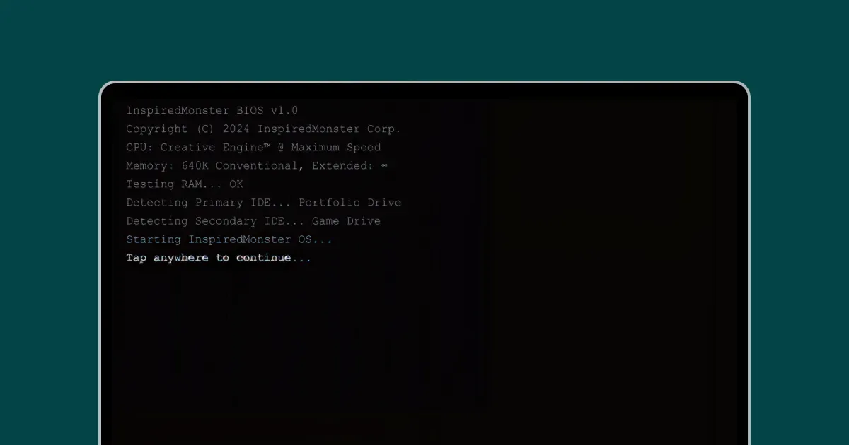
The boot sequence. Four seconds of nostalgia before the desktop appears.
I should mention. I'm a designer. I've been doing this for about ten years now. But my coding skills? Very limited. I can read code well enough to annoy a developer with feedback, but writing it myself? That's a different story. That part matters for the rest of this.
It was supposed to be a small project
It wasn't.
The thing about building a fake operating system is that every detail you add makes you notice ten more that are missing. I added a File Explorer and thought, cool, done. Then I realized it needed an address bar. And navigation. And actual folder contents. And wait, shouldn't the Recycle Bin work too?
I built an MS-DOS terminal that was supposed to be purely decorative. Then I added a command parser. Then easter eggs. Then color commands.
I built an Internet Explorer window. It was supposed to just be a frame. It turned into a full simulated IE5 browser containing something I called "Inspiredbook," which is basically what Facebook looked like in 2006. With a feed. And profiles. And likes. And pokes. And embedded viewers for Instagram, LinkedIn, Twitter, Dribbble, Medium, and GitHub.
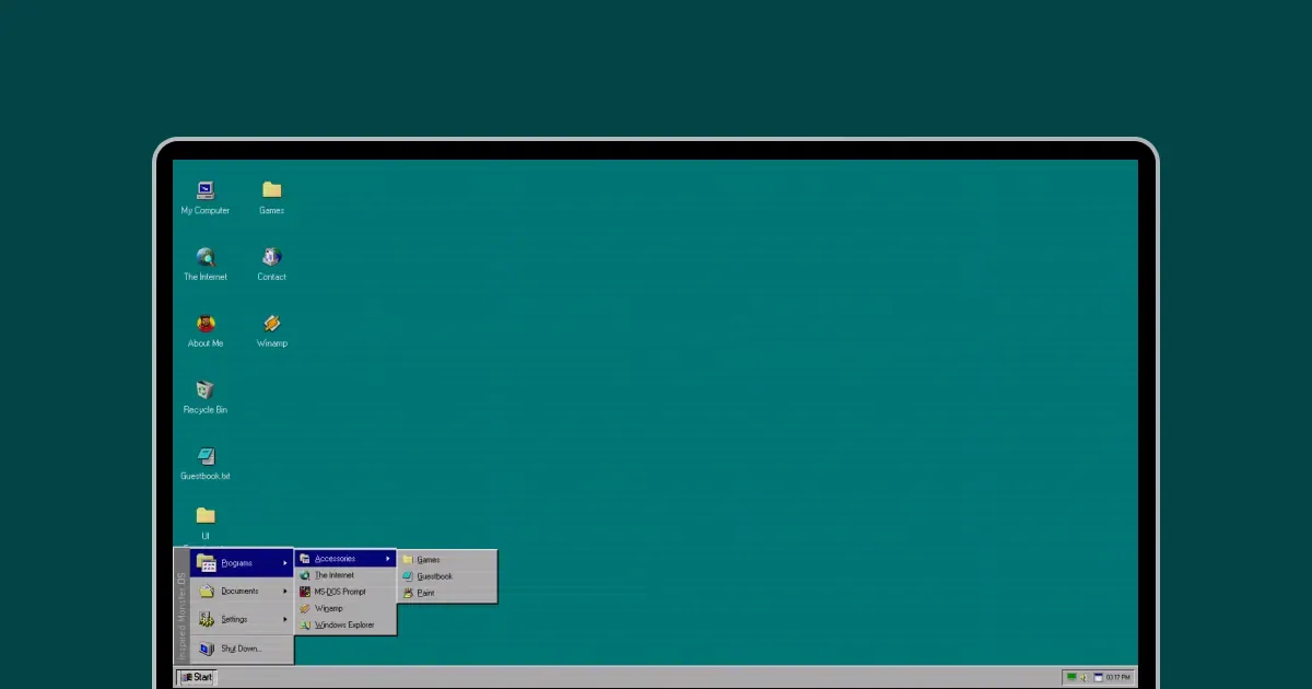
The Start menu with cascading submenus. Hover to navigate, just like the real thing.
I don't know at what point this stopped being a portfolio and started being an obsession, but it happened somewhere around the poke button.
How I actually built it
So here's the part people usually ask about. How does a designer who barely codes build something like this?
The answer is Claude. Anthropic's AI. I used it as my coding partner for the entire project.
But I want to be real about what that looked like, because "I used AI to build this" sounds like I typed one prompt and a portfolio appeared. That's not what happened. At all.
What actually happened was something like pair programming. I'd describe a feature in plain English. "I want a window that looks like the Win95 File Explorer, with an address bar at the top and a grid of folder icons." Claude would write the code. I'd test it. And then I'd come back with notes.
Lots of notes.
"The title bar gradient is wrong. Real Win95 goes from dark navy to a lighter blue, not the other way around." "The icons are too crisp. They need to feel pixelated." "When I minimize a window, it should slide down to the taskbar. Right now it just disappears."
This was the whole workflow. Describe what I want. Get the code back. Test it. Send screenshots. Explain what's off. Get a fix. Test again. Repeat about fifty times per feature.
I was basically doing design QA on AI-generated code. And weirdly, that turned out to be a very natural way for a designer to build things. I didn't need to understand every line. I just needed to know what the result should look like and feel like. And after years of design work, that part I could do.
The hardest part wasn't the prompting. It was knowing when something looked wrong and being able to explain why.
First, I just tried to understand the code I'd forked. Claude was helpful here. I could point at a file and say, "What does this do?" and actually learn how things work by asking questions about a real project instead of reading docs.
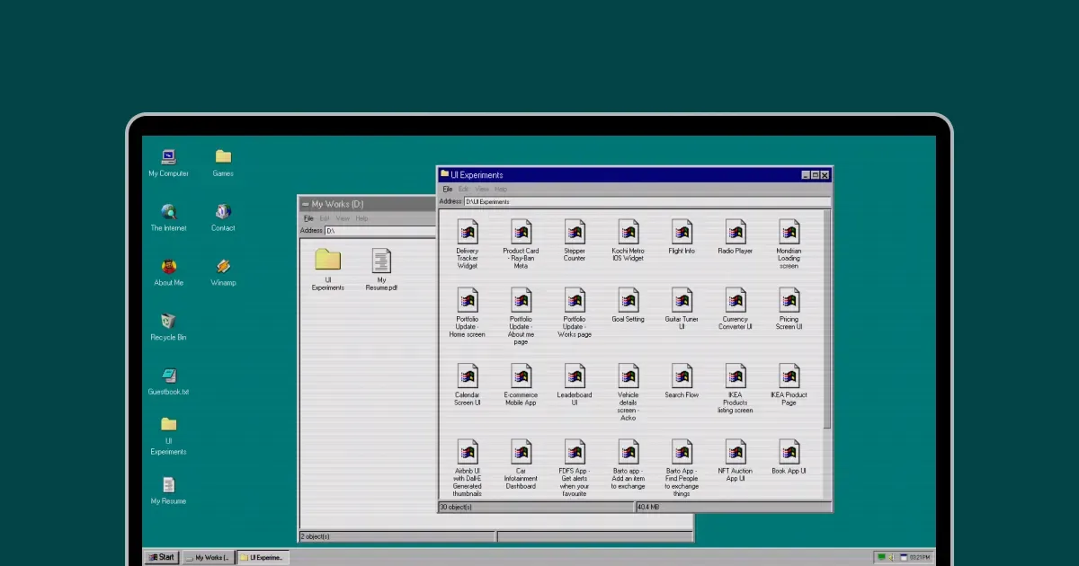
The File Explorer. Browse projects the way you'd browse folders in 1995.
Applications came next. File Explorer. The terminal. A Notepad window that I connected to a database so people could leave guestbook messages. That guestbook idea actually came from my friend Niyas, who built something similar for his own portfolio. I saw it and immediately thought, I need this, but in a Notepad window. I added embedded JS Paint and Winamp music player to share my Spotify playlist because why not?
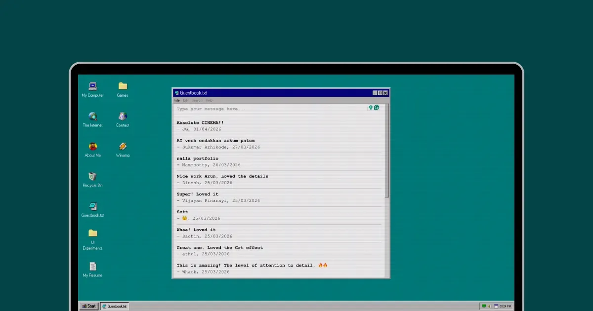
The guestbook. Visitors leave messages in real-time, inside a Notepad window.
And then Internet Explorer happened. I already told you about that one. Let's move on before I start explaining the poke system.
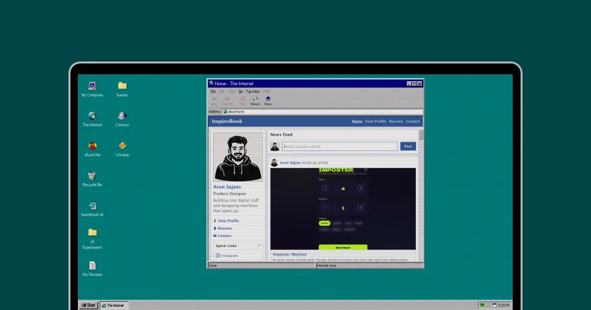
Inspiredbook. A fake 2006 Facebook living inside a fake Internet Explorer.
The last phase was all polish. Sound effects, A CRT scanline filter you can toggle. A Konami code easter egg that triggers a Blue Screen of Death. Mobile responsive support, which was honestly harder than half the features combined.
The Notepad mistake
Here's a small story about a design decision I got wrong before I got it right.
The case studies for my projects were originally plain .txt files that opened in the Notepad window. Thematically? Perfect. A case study in Notepad! So on-brand!
But have you ever tried to read 2000 words in a monospaced font inside a tiny window with no formatting? It's awful. Nobody is going to do that. I wouldn't do that, and I wrote the thing.
So I scrapped Notepad and had the case studies open inside Internet Explorer instead, rendered as replicas of Medium articles. And there's a reason Medium's reading experience works so well. That serif font, the line height, the column width. It's just comfortable. Putting that inside a simulated IE5 window gave me the best of both worlds. The nostalgia wrapper, but with content people would actually want to read.
Sometimes the best design decisions come from admitting your first idea sucked.
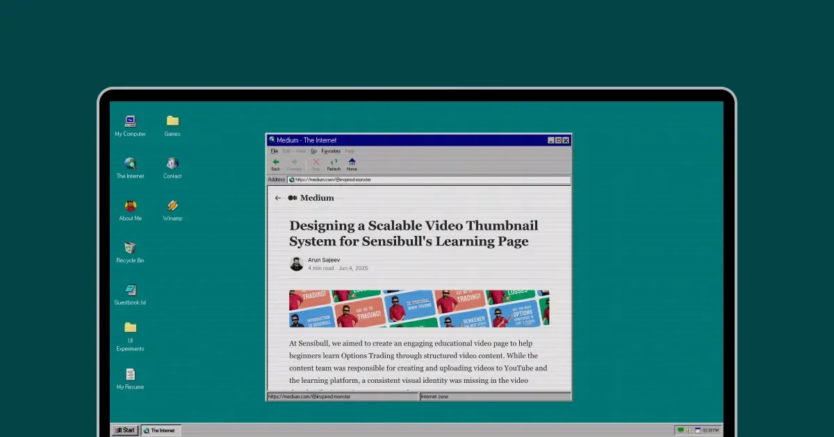
Fake Medium inside the fake browser
Some things I'm happy with
The boot sequence. Load the site, and you get a DOS POST screen that counts memory and detects drives. Then the Windows splash with a progress bar. Then the startup sound. Four seconds, but people always mention it.
The Recycle Bin. You can drag icons into it. It asks, "Are you sure?" You can open it and browse your deleted stuff. You can restore things. Completely unnecessary. Everyone loves it.
The sounds. Startup, shutdown, click, double-click, recycle, restore, BSOD. The startup sound alone does more for the whole experience than anything visual.
The Konami code. Type ↑ ↑ ↓ ↓ ← → ← → B A anywhere, and the whole screen goes Blue Screen of Death. I've watched people discover this, and it never gets old.
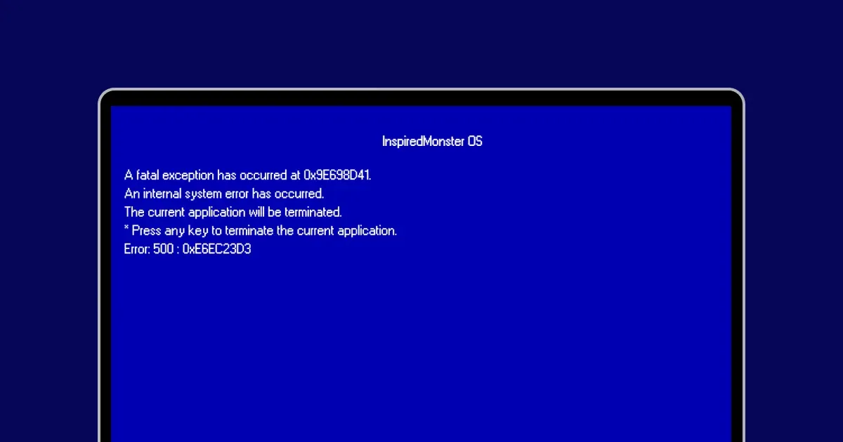
The Konami code BSOD. Type ↑↑↓↓←→←→BA to trigger it.
And just the window management in general. Dragging, minimizing with a slide animation, clicking to bring things to the front, and resizing from corners. Getting all of that to feel smooth took way more iteration than I expected. But when it works, it works.
About the AI part
I know some people will read this and think, "So you didn't really build it." I get that. So let me be specific.
Me: All the design decisions. What to build, what it should look like, and when something was off. The content. The curation. The experience. Every obsessive pixel-level complaint.
Claude: The actual code. Components, state management, CSS, and database integration. The stuff I could not have written myself.
Could I have learned Vue and done this without AI? Maybe. But realistically, I'd still be halfway through a Udemy course, and my portfolio would still be a Notion page with a Dribbble link.
I don't think using AI makes me a developer. It doesn't. But knowing what good design looks like, and being able to explain exactly why something isn't right, turns out to be a really useful skill when you're working with AI. The taste was mine. The code was Claude's. The project needed both.
What I'd tell you
Scope creep is real, and it's fun. That's the dangerous part. Every feature felt like "just one more thing." I don't have good advice here. I should have stopped earlier. I didn't. The project is better for it, but my sleep schedule wasn't.
Nostalgia does a lot of heavy lifting. People don't just look at this site. They play with it. They open the Start menu just to close it. They try random keyboard shortcuts. They leave guestbook entries. The Win95 shell creates this emotional permission to explore that a normal website just doesn't give you. I got lucky picking the right concept.
Don't build everything from scratch. I started with an open-source foundation, and that was probably the smartest thing I did. Put your energy into the parts that make your thing yours.
If you want to build something, just start. You don't need to know how to code. You don't need a full-stack course. You need an idea you're excited about, a willingness to iterate, and the tools are there now. Use them.
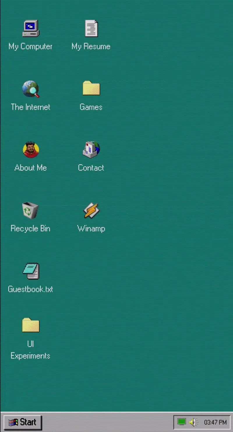
It works on mobile too. Windows auto-maximize and the Start menu switches to drill-down navigation.
The site is live at inspiredos.com. Go try the Konami code. Leave something in the guestbook. Open Internet Explorer and poke me on Inspiredbook.
And if you're a designer who's been putting off building your portfolio? Maybe this is the push. It doesn't need to be Windows 95. It just needs to be something you'd actually enjoy making. That's the whole secret, honestly.